
Using AI Artwork for Signage: What You Need to Know Before Printing
A practical checklist for turning AI-generated designs into files that actually print the way you expect on signage, resolution, colour, format and layout, explained simply.
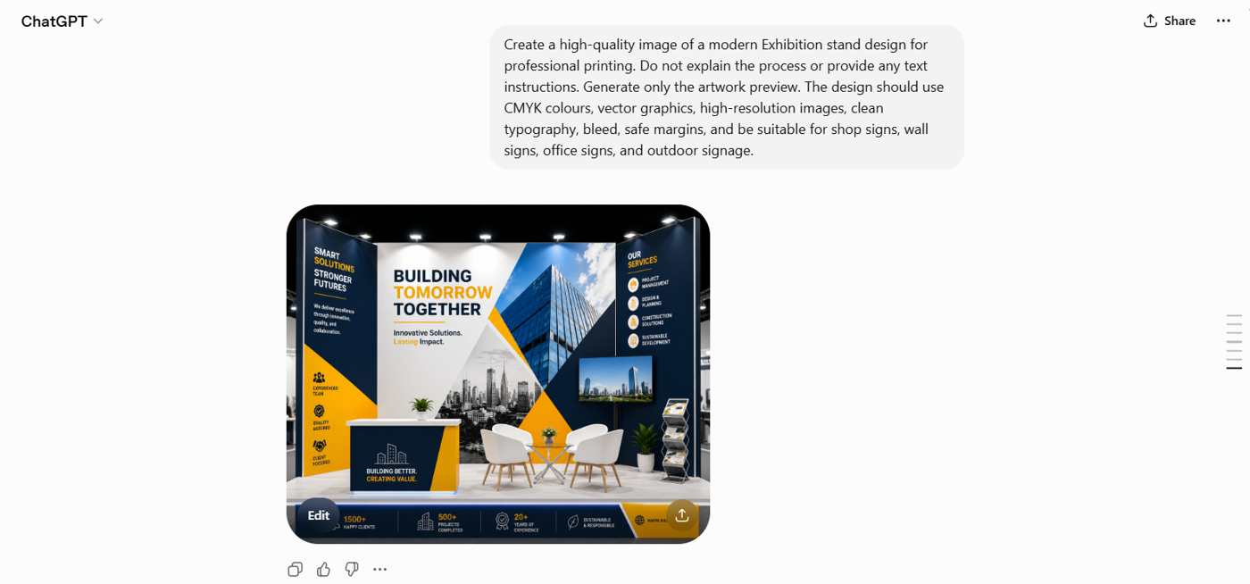
AI design tools can generate impressive visuals in seconds, and we’re increasingly asked to print them on signage. Signage is a demanding test for AI artwork: signs are often read up close, rely on sharp text and accurate brand colours, and have no room for the soft edges or odd details AI can introduce.
That doesn’t mean AI has no place in sign design, it just needs handling correctly. This guide explains what AI does well for signage, where it tends to fall short, and how to prepare your files so your finished signs look sharp, legible and on-brand.
The Quick Answer
AI can create amazing graphics.
They are not automatically print-ready.
To be print-ready, your file needs to meet a few technical requirements:
- High resolution (typically 300 DPI)
- Correct colour mode (CMYK)
- Proper file format (PDF preferred)
- Exact dimensions for your print size, or scaled to the correct ratio (e.g. 50% of full size)
- Clean, sharp details with no errors
- 3mm bleed and crop marks
Most AI tools don’t output these settings by default, because they’re built for screens — not print.
What “Print-Ready” Actually Means
1. Resolution (DPI)


- Print standard: 300 DPI
- Typical AI output: 72–150 DPI
Low resolution means blurry prints. A large signage job, for example, might need 12,000+ pixels of width, yet many AI images are generated far smaller than that.
2. Colour Mode (RGB vs CMYK)

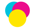
Screens use RGB. Professional printers use CMYK. When your design converts from one to the other:
- Bright colours can look duller
- Blues may shift
- Skin tones may change
- Neon colours lose their vibrancy
3. File Types
AI tools usually export JPG or PNG. For printing, better formats are:
- PDF (preferred)
- Vector files — AI, SVG, EPS (ideal for logos)


Why it matters: JPGs can lose quality through compression, and AI does not create true vector files. Vector artwork scales to any size without losing quality; raster (pixel) artwork blurs when enlarged.
4. Size & Layout

AI square output

AI often creates square images (e.g. 1024×1024). Print designs, however, need specific shapes — wide signage, portrait posters, set flyer sizes, and so on. Cropping or stretching a square image to fit usually ruins the layout.
Common Problems With AI Print Designs
Here’s what typically goes wrong:
Blurry or pixelated images
Caused by low resolution. Fix: start with higher-res images or upscale correctly.
Strange details (artifacts)
Warped shapes, broken text, odd textures, caused by AI generation errors.
Colour changes
Looks great on screen, dull in print, caused by the RGB → CMYK conversion.
Gradient banding
Visible steps instead of smooth colour fades.
Poor composition
Important elements get cut off when the image is resized.
How to Fix AI Designs for Printing
Follow this simple workflow:
- Generate at the highest resolution possible — minimum 300 DPI at the size you need.
- Zoom in (150%) and inspect the details carefully.
- Upscale the image if needed using professional tools such as Gigapixel AI, Adobe Firefly or Topaz Labs.*
- Clean up any errors manually.
- Convert colours to CMYK.
- Set exact print dimensions.
- Export as PDF (preferred).
*Please note: we have no affiliation with the tools listed above and accept no liability should you choose to use or pay for these services.
When AI Works Well (and When It Doesn’t)
For signage, AI is best kept to backgrounds and decorative imagery. Logos, wording and brand colours, the parts customers actually read, should be created or replaced manually for a clean result.
Great for
- Backgrounds and textures
- Creative illustrations
- Large signage viewed from a distance
- Hybrid designs (AI background + real text/logos)
Not ideal for
- Logos and branding
- Text-heavy designs
- Product photography
- Faces or detailed human images
- High-precision designs
If it needs to be perfect, don’t rely on AI alone. AI-generated text often contains errors or distortions, so always replace it manually.
AI Prompts to Help
Below are high-quality, ready-to-use prompts to help AI generate print-friendly artwork from the start. They’re designed to reduce common issues like low resolution, poor composition and colour problems. Edit each one to suit the item you’d like to print.
Need Help?
If you’re unsure whether your design is ready to print:
- Get a professional check. We offer an artwork checking service for a small additional fee — we’ll review your file and confirm it’s print-ready.
- Test before printing.
- Ask a professional designer to create your artwork. Our design service starts from £35 + VAT, depending on requirements, and we’re happy to provide a quote.
It can save you time, money and the cost of reprints.