What Makes a Great Shopfront Sign? Top Tips from UK Designers

Walk down any UK high street, and you’ll notice it straight away — some shopfront signs pull you in without effort, while others barely register. It’s not always about size or budget. More often, it comes down to how clearly and confidently the sign stands out and communicates effectively within seconds.
Most people decide within a few seconds whether a shop feels worth stepping into. That decision often starts with the sign. The businesses that stand out tend to invest in well-thought-out, personalised outdoor signs that reflect who they are, rather than settling for something generic that simply fills the space.
Top Tips from UK Designers for Creating a Great Shopfront Sign
Most shopfront signs don’t fail because of budget — they fail because the basics are overlooked. If you get a few key things right from the start, everything else tends to fall into place.
First Principle: Clarity Always Comes First
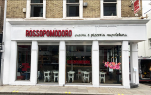
A great shopfront sign shouldn’t make people stop and figure it out. It needs to be clear the moment they see it — whether they’re walking past or catching a glimpse from across the road. That comes down to simple, practical choices: easy-to-read fonts, proper spacing, and strong contrast between text and background.
There’s a rule many designers stick to: if it takes more than a second to read, it’s too complicated. It might look impressive up close, but out on a busy street, clarity will always outperform creativity.
Strong Brand Identity Makes a Sign Memorable
Your sign does more than show your name — it gives people a feel for your business before they even step inside. The colours, typography, and overall style should feel consistent with your brand, not something that’s been thrown together at the last minute.
Generic signage tends to blend in because it doesn’t leave an impression. In contrast, well-designed personalised outdoor signs help build familiarity over time. People may not notice it consciously, but they begin to recognise your business simply from how it looks.
Material Selection: Where Design Meets Durability
In the UK, a sign has to handle more than just looking good. Rain, wind, and constant exposure to the elements can wear things down faster than expected. That’s why choosing the right material is just as important as the design itself.
Material | Where It Works Best | What You Should Know Before Choosing |
Acrylic | Modern retail fronts, salons, and indoor-facing signage | Gives a clean, polished look, but can show scratches over time — better suited where it won’t face heavy wear or constant contact |
Aluminium | High-street shops, long-term outdoor signage | Extremely durable in UK weather and holds colour well, but the upfront cost is higher compared to basic materials |
Wood | Cafes, boutiques, and independent shops with a rustic feel | Visually strong and full of character, but needs regular sealing or treatment to prevent weather damage |
Composite (e.g., Dibond) | General shopfronts, cost-conscious projects | A reliable all-round option — lightweight and weather-resistant, though it doesn’t quite have the premium finish of metal or bespoke materials |
Choosing lower-cost materials may seem practical initially, but they often result in higher long-term replacement costs. A sign that fades, warps, or wears out quickly ends up needing replacement far sooner than planned.
Lighting: The Difference Between Seen and Missed
Lighting can make a noticeable difference, especially during the darker months or in the evening. A well-lit sign doesn’t just improve visibility — it gives your shopfront more presence.
Options like LED lighting, halo-lit lettering, and lightboxes each create a different effect, so it really depends on the look you’re going for. That said, not every business needs illumination. In some settings, particularly more understated or heritage areas, a non-lit sign can feel more appropriate. The key is choosing what suits your space, rather than following what others are doing.
Size & Placement: Getting Noticed for the Right Reasons
Even a well-designed sign can lose its impact if the size and placement aren’t proportionate to the space. It needs to feel proportionate to your shopfront and visible within the context of the street. Too small, and it disappears. Too large, and it can look out of place.
Where you stand matters just as much. Ideally, it should sit naturally within people’s line of sight, whether they’re walking by or approaching from a distance. It’s also worth keeping local UK planning guidelines in mind, as certain areas have restrictions on signage size, lighting, and placement.
Designed for the Industry You’re In
Different businesses call for different approaches. What works for one type of shop doesn’t always translate well to another.
Retail spaces often benefit from bold, attention-grabbing designs that pull people in. Cafés and restaurants tend to go for something warmer and more inviting, while salons and boutiques usually lean towards a more refined, polished look. In the property sector, the focus shifts toward visibility and clarity, which is why formats like estate agent boards remain so effective.
Trying to copy another industry’s style rarely delivers the right result. The most effective signage is designed with your audience and how they interact with your space firmly in mind.
Consistency Across the Entire Shopfront
A strong sign on its own is a good start, but it works far better when everything around it feels consistent. Your shopfront should feel joined-up from the main sign to the window graphics and even the interior details visible from outside.
When everything aligns, it creates a more professional and trustworthy impression. In many cases, consistency does more for your brand than trying to make one element stand out too much.
Common Mistakes That Ruin Shopfront Signs
You don’t need to overcomplicate things to get signage right, but you do need to avoid a few common mistakes that can quietly undermine the whole look.
- Overcomplicating the design - Trying to include too much extra text, decorative fonts, or cluttered layouts usually reduces visibility and overall impact rather than making it more impressive.
- Ignoring readability – Poor contrast, small lettering, or awkward spacing can make even a well-designed sign difficult to understand at a glance.
- Choosing the wrong materials – Lower-quality materials might save money upfront, but they often fade, warp, or wear out quickly in the UK's weather.
- Getting lighting wrong (or skipping it entirely) - Either overdoing it or not considering lighting at all can affect visibility, especially during evenings and winter months.
- Inconsistent branding – When your sign doesn’t match your colours, style, or overall identity, the entire shopfront can feel disjointed and less professional.
Why Working with Experienced Designers Makes a Difference
Designing an effective shopfront sign involves more than just choosing colours and fonts. It requires understanding visibility, materials, placement, and how the sign performs in real-world conditions.
Working with experienced signage professionals ensures that your sign is not only visually appealing but also practical, durable, and aligned with your brand. From concept to installation, a well-planned approach helps avoid costly mistakes and delivers long-term value.
Conclusion
When you strip it back, a great shopfront sign isn’t about one standout feature; it’s about how everything works together. Clear design, strong branding, the right materials, thoughtful placement, and consistency all play their part in making sure your sign actually does its job.
It’s easy to see signage as a one-off cost, but in reality, it represents your business every single day. Get it right, and it keeps working for you, quietly building trust, visibility, and recognition over time.
If you’re planning a new shopfront sign, it’s worth getting it right from the start. You can explore our personalised outdoor signs or estate agent boards, or simply book a consultation to discuss what would work best for your space.
Frequently Asked Questions
What makes a shopfront sign effective?
An effective shopfront sign is clear, easy to read, and reflects your brand. It should catch attention quickly while still feeling consistent with your business identity.
What is the best material for outdoor shop signs in the UK?
Materials like aluminium and composite panels are popular because they handle UK weather well. The best choice depends on your budget and desired finish.
Do I need permission for a shopfront sign in the UK?
In many cases, yes. Local councils often have rules around size, lighting, and placement, so it’s best to check before installation.
Should my shop sign match my website branding?
Yes, consistency across online and offline branding helps build recognition. When your sign reflects your website and other visuals, it creates a more cohesive and professional image.

A digital and print specialist with over decades of experience ranging from design to production, Nimesh is committed to quality and working with clients to add value to their businesses. His technical knowledge of print machinery operation is matched only by his love of the print industry.
