Everything to Know What’s This Typeface is About

A good understanding of the typeface is very crucial for the effective transmission of any message, especially in written form type. With the wide variety of available typefaces, simply knowing which one would suit your needs better can have an impact on readability and aesthetics.
This blog will pave the way to understanding different types of typefaces, which are of the most readable kind and imparting different tips to use them.
The Importance of Readable Typefaces
When considering what's this typeface most easy to read, it's crucial to understand that readability is influenced by several factors, including font style, size, and spacing. A well-chosen typeface can improve comprehension and engagement, making it vital for both digital and print media.
What is the Easiest Font to Read?
Named after the broadcaster's founder, John Reith, BBC Reith is a custom sans serif typeface that was first used by the BBC in 2021. Research indicates that these fonts are universally acknowledged for their clarity. Here are some of the most easy to read font for print:
- Helvetica: A classic sans-serif font known for its clean lines and versatility. It's widely used in advertising and signage due to its legibility from a distance.
- Arial: Another popular font for printing sans-serif options, Arial is often used in business documents and websites. Its simple design makes it easy to read across various formats.
- Times New Roman: A traditional serif font that provides a formal appearance. It’s particularly effective in printed materials like books and newspapers due to its high readability.
- Verdana: Designed specifically for screens, Verdana also performs well in print. Its wide spacing and large x-height make it an excellent choice for body text.
These print fonts list are not only aesthetically pleasing but also functional, ensuring that your message is conveyed clearly.
Best Letterpress Typeface Fonts for Printing
When selecting a print typeface for printing, consider the following options that consistently rank among the best:
Typeface | Styles | Key Features |
Century Gothic | Sans-serif | Neat design, great for neon tag and headlines |
Garamond | Serif | Elegant with high readability |
Futura | Sans-serif | Geometric shapes, clear even in small sizes |
Lato | Sans-serif | Soft curves, dynamic appearance |
Georgia | Serif | Designed for clarity on screens and print |
These fonts have been selected based on their performance in various printing scenarios, making them reliable choices.
Factors Influencing Font Choice
When deciding on the best font for print, consider these factors:
- Purpose - Choose a font that suits your aim, whether it is to inform or persuade.
- Audience - Select a font that is appropriate for your target group. Younger audiences, for example, may prefer more modern sans-serif fonts.
- Medium - Choose a typeface appropriate to your medium, as different fonts will lend themselves better to either print or digital formats.
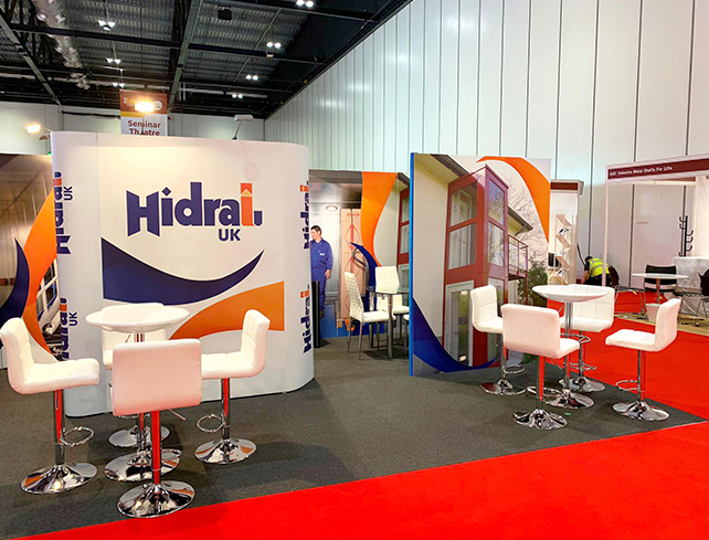
Popular Font Trends for Exhibition Boards
Besides normal fonts, designs such as custom neon tags are gaining acceptance in exhibitions. This comprises the use of bold sans serif fonts, striking against vibrant backgrounds. For example, with the use of a font like Montserrat, a modern look might grab attention and remain easy to read.
When deciding on the kind of font to use when designing a bespoke exhibition board, be conscious that the selected font should, of course, suit the overall aesthetics of the board while appearing legible. Use Roboto, or Open Sans fonts, as these stand out even when viewed from a distance.
Improve Your Business With Typeface
Selecting the right typeface is more than just an aesthetic choice; it directly affects how your message is received. Whether you’re designing a business card or an exhibition board, understanding what makes a font easy to read is crucial. Fonts like Helvetica, Arial, and Times New Roman remain top choices due to their legibility and versatility.
As you explore custom options like neon tags or exhibition boards, remember that clarity should always be at the forefront of your design strategy. By choosing us for the right typeface, you can enhance communication and ensure your audience engages with your content effectively.
A digital and print specialist with over decades of experience ranging from design to production, Nimesh is committed to quality and working with clients to add value to their businesses. His technical knowledge of print machinery operation is matched only by his love of the print industry.
February 13, 2025

