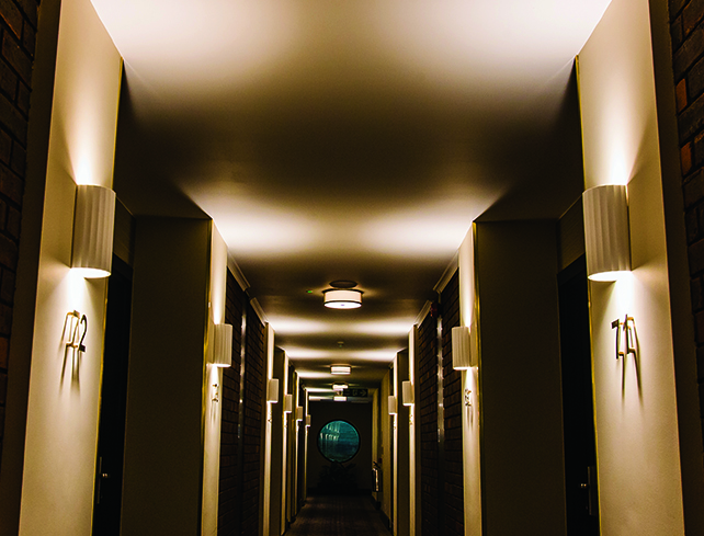
The Power of Colour and Font in Signage Design

Can the right font and colour for a sign have a strong influence on the actions of customers?
Absolutely. Design psychology shows how small visual choices can have a major impact on behaviour.
For UK businesses, whether you are advertising a proper, directing foot traffic or promoting safety on site, a sign plays an important and most effective role in this.
Role of Design Psychology in Modern Signage
Before we begin, let me explain that design psychology focuses on visual components such as colour, font, and layout.
For the signage sector, this involves producing a design that does more than just convey information; it also maintains engagement and encourages action.
Businesses may improve the effectiveness and visibility of their signage by understanding the psychological influence of design choices.
In the UK, signage is frequently the first point of contact a customer makes with a business. Your signage must do more than merely deliver information, whether it is guiding people around a building site or highlighting a house for sale.
Colour Psychology in Signage: Guiding Emotions and Decisions
Understanding the psychological impact of colours allows businesses to produce signage that not only attracts attention but also allows them to construct the brand's identity, especially in wayfinding signage, where colour helps direct movement and mood.
Common Colour Associations
- Red: Gives a clear representation of urgency and excitement, which is perfect for sales and promotions.
- Blue: This is the colour of professionalism, which is suitable for corporate settings.
- Green: Gives a clear representation of health and sustainability; popular for eco-friendly businesses.
- Yellow: Optimism and energy; great for highlighting key information.
Warm vs Cool Colours
- Warm colours: Represent about the energy and grab attention, making them ideal for promotional or urgent signage.
- Cool colours: Symbolise calmness and reliability, perfect for businesses aiming to build trust or professionalism.
Font Psychology: More Than Just Style
Fonts are not just about the looks, they also shape the interpretation within the customers' interpretation and react towards the message. Use of the right font allows businesses to build trust and create lasting impressions.
Choosing the Right Typeface: Tradition vs Modernity
- Fonts like serif appear to be a more traditional and reliable option. These can be commonly used by institutional law firms or financial services.
- Sans serif typefaces are sleek, contemporary, and have a greater contrast. It is a go-to option for tech companies and retail signs.
Readability and Visibility in Real-World Settings
- Signage such as wayfinding signage must be readable at a glance.
- Avoid fonts that are too decorative or stylised because this makes them less readable.
- Use a font with strong contrast and clean spacing to make the message clear.
Font Weight, Size and Action-Oriented Messaging
- Use bespoke exhibition stands, it's bold and high-contrast fonts naturally draw attention.
- The larger the font greater the visibility and gives a clear signal of importance.
Layout, Contrast and Visual Hierarchy
A sign layout influences how quickly and clearly a message is understood. By using size, spacing and contrast effectively, you can guide the viewers to the various details.
- Structure Your Sign for Easy Flow: Start with the most important message at the top and show visitors what should be read first, second and last.
- Light vs Dark: Choose Combinations That Work: You should always ensure that the strong difference between text and background colour is maintained as this gives easy readability.
- Clarity Wins Over Complexity: Keep the design clean and uncluttered. Too many colours or messages at once can confuse people and reduce impact.
Turning Design Psychology into Business Impact
Good signage is not only about how it looks, it is also about the performance which it delivers. When you apply design psychology to signs, it will help you to deliver a clear understanding and improve the action taken on delivered messages. This means better results for your business, from more foot traffic to safer work zones.
Case Insights: Measurable Results from Smart Design
- Shops making use of bold fonts are likely to have stronger customer attention.
- Safety is increased by making use of clear directional signs and reducing distractions.
Applying Design Psychology
- Use warm colours to create a welcoming feeling.
- Keep wayfinding signs bold and minimal to avoid distractions.
- Use a strong contrast to draw attention to the warning.
When to Consult a Professional Signage Designer
- If you are unsure about the use of design, colour and layout.
- If you are launching the new location, and want consistent messaging.
- When clarity is essential and safety, health, or compliance are important.
Design with Purpose
Font and colour selections affect people's thoughts and feelings in ways that go beyond style. Businesses may transform signs into instruments that direct activity, enhance clarity, and create a lasting impression by considering psychology from the outset.
A digital and print specialist with over decades of experience ranging from design to production, Nimesh is committed to quality and working with clients to add value to their businesses. His technical knowledge of print machinery operation is matched only by his love of the print industry.
April 7, 2025

